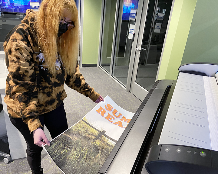
The large format printer in the Technology Lab can print posters up to 36" by 48."

Content is laid out in 3 easy-to-follow columns
Colors are eye-catching but not overwhelming
Colors are consistent throughout the poster
Clear headings for each section
Text is broken into smaller pieces, so there are no huge blocks of text
Image used with permission. See comments from the poster creator at Librarian Design Share.

Background, color, and font are distracting
Too much text!
No 'flow' to the poster
Boxes are oddly shaped and poorly aligned
Juvenile graphic instead of relevant image from experiment
Image used with permission. Get more information on Colin Purrington's website.
Use these resources to find open-license and public domain images, icons, and illustrations to use on your poster. Don't forget to properly cite your source.
Having trouble finding the right colors? Use these resources to create harmonious, eye-catching color palettes.
Use this tool to double check that your text and background colors are easily readable and accessible.